 Click here to see the example >>> Click here for the style sheet >>>
Too often the hippy cry is "everything is relative man" well it just isn't true, some things are absolute, Einstein knew that and you will too soon. As with maps in geography, graphs in maths lesson at school and just about everything thereafter the position of something is measured using X and Y coordinates, X is horizontal and Y is vertical . The same is true of the browser window. The one thing that is absolute is the top left corner of the window, it will always be there and it will always be 0,0. The 0,0 coordinates relate to the top left corner of the window. In general all distances are measure relative to this point.
Click here to see the example >>> Click here for the style sheet >>>
The tags and content placed in the document have all been displayed ina a relative manner that is to say that the position of the first paragraph on the screen is related to the position of the <h1> tag that precedes it, this in turn is plced relative to the <p class="imageholder"> and <img />tag before it and this <p> and <img /> tag are positioned relative to the main <h1 id="pagebanner"> tag. All of these tags are inside the <body></body> tag which sits by default at the 0,0 point top left of the browser. This, combined with the text alignment discussed during the introduction of the float property make the content display in the order you see it. There is a small gap between the edge of the browser window and the content to stop the text crashing into the edge just like we created for the imageholder <p> tag. The browser default style sheet holds a margin value for the <body> tag, this is usually 10px.
Any tag can have a margin and a padding, and we've touched briefly on both of these when laying out images. Margin and padding can be declared in a number of ways depending on the complexity of the margin or margins to be styled. For now I will focus on margins, padding works the same way.
The simplest margin to declare is one that is the same width all around the four ouside edges of the element with a simple single size specified in pixels.
margin:10px;
Adding four separate sizes alows you to declare four different margin sizes for an element. The order that these are put in is easy to remember, it is clockwise from the top, so the first is the size of the top margin, then the right, then the bottom and finally the left margin. The example below sets the top and bottom margins to 10px, the right margin to 20px and provides a large indent to the left of 150px;
margin:10px 20px 10px 150px;
CSS also allows four individual properties to be declared as an alternative to the four part single declaration.
margin-top:10px; margin-right:20px; margin-bottom:10px; margin-left:150px;
Click here to see the example >>> Click here for the style sheet >>>
The code above has hthe same meaning as the four part single declaration.
The same simple, four part single, and individual declarations all apply to padding as well as margin in exactly the same way.
All our content tags are held in the <body> tag and as already stated, the browser has a default style sheet setting for the body tag margins and the content inside the body tag is held relative to it and the content before and after it.
The body tag already has a type selector in the style.css style sheet. It can take any of the margin or padding properties onboard as part of it's style when added to the type selector declaration block.
You may want to lay your page out so that the content has a large left margin to achieve a particular look or layout.
For example, to push to top of body content down from the top of the browser window by 90px to create a gap at the top of the window just add a value to the margin-top property to the body type selector's declaration block.
margin-top:90px;
By default everything in the document is placed relative or in relation to the things that come before and after it in the code making the content read and flow in the same order as it was written.
As Einstein found out, only one thing is absolute, totally guaranteed to exist and have a fixed value. For Einstein that was the Speed of Light, for a web documentauthor it is the far less interesting top left corner of the bworser window. 0,0. It must exist and it is always at 0,0.
It becomes a lot more interesting when tags can be placed exactly in the browser window given precise sizes and positions regardless of the content in them using a few selectors.
The document has the <h1> tag with the unique idenifier pagebanner.These properties are added to the pagebanner id selector declaration block.
#pagebanner { background-color:#9999FF; color:#FFFFFF; font-size:24px; left:0px; margin:0px; position:absolute; top:0px; }
 Click here to see the example >>> Click here for the style sheet >>>
To make the page banner heading snap out from being positioned relative to the body and its content it needs to be positioned 0px from the top and 0px from the left of the screen and have the position attribute set to absolute additionally the margin is set to 0px around all 4 sides.
A page banner on a website is normally full width and at the top of the window. At the moment the banner is jammed up in the top left corner and the block surrounding the elment has shrunk to the size of the text. This can be seen clearly as the background blue colour has shrunk.
An absolutly positioned element not only has a top and left position to define its place on the window, it also has optional width and height properties. Width and height values are specified either as a fixed number of pixels lie all other CSS measurements or as a percentage of the size of the window.
The percentage is particularly useful with widths. A browser window can be any size or shape on any screen, if we set a fixed width for the width of the banner it would not stretch full width regardless of window size. Setting the width to 100% endures the block of the absolutely positioned <h1> tag stretches the full width of the window regardless of the window size.
#pagebanner { background-color:#9999FF; color:#FFFFFF; font-size:24px; height:50px; left:0px; margin:0px; position:absolute; top:0px; width:100%; }
 Click here to see the example >>> Click here for the style sheet >>>
The pagebanner id selector has had the width added to it to give the <h1> tag a 100% width and make th block background colour stretch the full width of the window.
The declaration block also has a height set of 50px; This results in stretching the block background down the page a total of 50 pixels in height. It is not common to use a percentage for the height of this kind of item.
Using absolute positioning for the elements that will be common to every document in your web site gives you real control over the layout of the page in the browser using CSS while leaving the content of the XHTML document in an untouched and still semantically harmonious state.
Absolute positioning with CSS allows you to get aggressive with the layout and force things to appear where you want them. Combined with the simple structure of XHTML a radical rethink of a page element is quite a simple task.
Lets attack the style sheet agressively and modify a few of the class and id attributes in the XHTML without disturbing the semantic meanings of the individual tags.
First thing to do is give the table of bookmarks list menu a makeover in the XHTML. Strip out the class attributes from the list item tags:
<ul> <li><a href="#skills">Skillsets</a></li> <li><a href="#career">Career To Date</a></li> <li><a href="#education">Education</a></li> </ul>
Create a second unordered list and add in a heading for the contents. The <ul> tag is given the unique identifier
<ul id="contentbar"> <li class="contents"> <h1>Contents</h1> </li> </ul>
Put the list of bookmarks inside the contents class list item, making a list within a list.
<ul id="contentbar"> <li class="contents"> <h1>Contents</h1> <ul> <li><a href="#skills">Skillsets</a></li> <li><a href="#career">Career To Date</a></li> <li><a href="#education">Education</a></li> </ul> </li> </ul>
Open the style.css file and strip out the old .contentsitem class selector and add some new selectors. We saw previously how multiple selectors can be given common properties by grouping the selectors ina comma separated list. The fist thing to do is shove all the relative page content across to create a gap on the left for the side content bar to sit in. To do this we need to set the left margin of all the heading and paragraph tags to a large size such as 220px while making all the other top, right and bottom margins zero.
While we're at it we'll amke all the paddings and thus the gaps underneath each block heading and paragraph tag the same too by setting the bottom border for all these tags to 10px and all other side and top paddings to 0px;
h1, h2, h3, h4, h5, p{ margin:0px 0px 0px 220px; padding:0px 0px 10px 0px; }
Add an ID selector to make the <ul> tag with the ID of 'contentbar' absolutel and position it 20px from the left of the page, 90px from the top of the apge and give it a width of 180px;
#contentbar { left:20px; position:absolute; top:90px; width:180px; }
This creates a box to the left of the text with a gap of 20px to the left window edge and a width of 180px giving a total width of 200px. The relative tags within the body all have a left margin of 220px so this should create the same 20px gap between the right ahnd side of the menu and the left edge of the relative tags.
CSS provides a way of describing elements within elements as names for selectors. These are known as contextual selectors as they reflect the context that a type, id or class selector may be in. The cascade helps benefit this process by allowing the styles added to cascade into the document structure to child elements.
What does all this mean? Our XHTML menu layout has a parent <ul> tag with the ID 'contentbar'. Inside it are numerous tags including <li> <a> <h1> and even more <ul> tags. The <h1> tags inside the contentbar will appear differently to either the regular <h1> tags or the <h1> tag with the pageheader banner by defining them in context with a contextual selector. To describe all and any tags of a type that are held inside a tag with the unique ID, the CSS selector is written as the ID name followed by the tag type separated by a space. To create a type selector that applied to all <h1> tags inside the element with ID contentbar the selector name is #contentbar h1 { }. <a> tags inside the element with ID 'contentbar would have the name #contentbar a { } and so on.
Create a contextual selector to give the <h1> tags inside the #contentbar element the same background colour as the pagebanner, white bold and 14px high text, give it 0px margin to override the left margin setting of 220px inherited by all <h1> tags by the h1 type selector and pad the space around the text out all four sides by 2px.
#contentbar h1 { background-color:#9999FF; color:#ffffff; display:block; font-size:14px; font-weight:bold; padding:2px; margin:0px; }
Set the background colour, margin and padding values for all instances of <a> tags inside the #contentbar tag.
#contentbar a { background-color:#EEEEFF; margin:0px; padding:5px; }
Set contentbar and all child <ul> and <li> elements to have zero margin and padding and no list bullet type displayed.
#contentbar, #contentbar ul, #contentbar li { list-style-type:none; margin:0px; padding:0px; }
Finally set up a class selector for all the elements given the class attribute value of contents, setting font-size, borer, margin and an additional small selector for all <li> elements contained within elements of class 'contents'.
.contents { font-size:12px; border:0px; margin:0px; padding:0px 0px 10px 0px; } .contents li { display: inline; list-style-type:none; }
 Click here to see the example >>> Click here for the style sheet >>>
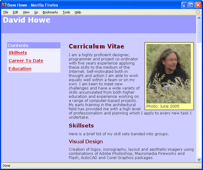
As you cans ee from the preview the content sidebar is now in place to the elft with all the content pushed with a large left margin to clear it in the display. The <h1> tag inside the outer list is white, bold and with a blue background and forms the header for the side bar. The list of links within the sidebar each have a pale blue background colour to make the shape of the rest of the bar in the document.
Take a good look at the source code and the CSS file that creates this page. The layout is quite complex in the browser window but the simple, structured XHTMLis still as meaningful as it was when it wsa first authored. the layout ahs been created using a series of type, id and class selectors and some contexual selectors in the style.css CSS file.
The page is complete. It has a banner, navigation and content with pictures structured into headings, subheadings and paragraphs. This is the structure of just about any web document that makes up part of a site.
Click here to see how this semantically harmonious approach is good for the Googlebot >>>
